New Club crest is revealed
Banbury United has a fresh look for a fresh start
We are pleased to reveal our new logo today as the Club embarks on a concerted comeback with the most energetic vision for our future.
Thank you to everyone who participated in our fan consultation, which has helped us get to this point of being able to proudly present ourselves with a modern look worthy of a relevant, bright and confident football club, in 2024 and beyond. We present a contemporary badge that will look much more professional, particularly on clothing, merchandise and other branded items that go towards increasing the brand value of Banbury United.
Based on your feedback in our consultation, the logo features the following enhancements:
- Developed roundel and type, to simplify it, make it less ‘American’ and use a typeface that felt more contemporary.
- Thickened white border so it sits better on a red shirt.
- Added simple facial features to make the Puritan more recognisable.
- Reduced the colours to just one red, gold and white to be closer to the Club’s identity.
- Softened some of the Puritan’s features, to make it look less like a bottle-stop!
Not everyone will like this logo straight away of course. That’s the nature of design projects, regardless of the entity involved.
Please read this article in full, published yesterday, which explains why this particular design route was chosen. It answers why we are continuing to use the Puritan man in this iteration of our identity at this point in time (as opposed to other Banbury-related symbols), as well as how no costs have been incurred in its development. This is not an expensive project for the Club, but it is the start of attracting a lot more wealth into it.
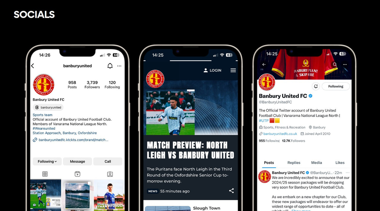
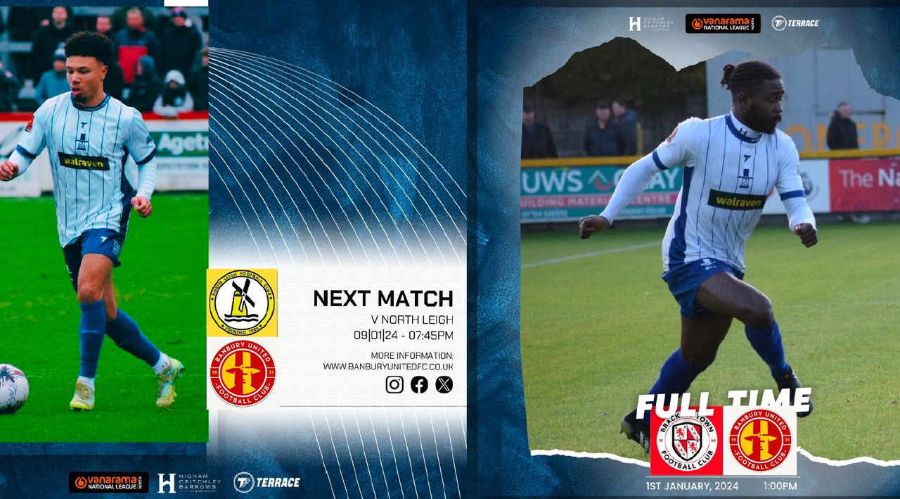
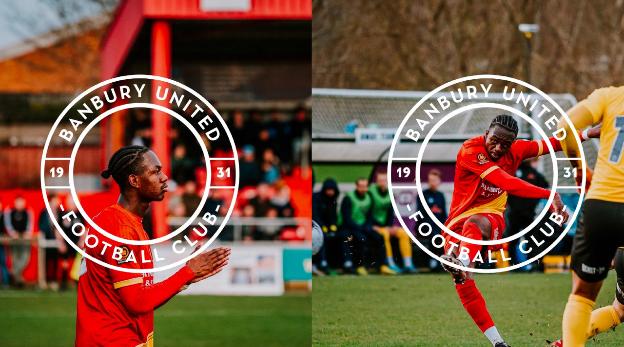
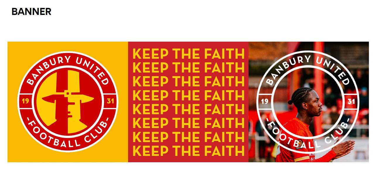
See below for various logo applications:
![]()
![]()
![]()