

Origins of the ‘Puritan Man’ logo
Explained by Malcom Wood who created him
The Club is currently running a fan consultation on proposals for a new logo. Click here for details on how to complete a survey, if you haven’t already.
Malcolm Wood, a Puritan who regularly attends matches, has helped us with the historical aspects of the project. We asked him to explain how our current logo came into existence.
“In the 1960s when I first came to Banbury and started supporting Banbury Spencer as it still was then, the logo of the club was the crest of the Borough of Banbury with the sun and shield. A typical civic design which was useful on printed matter and letterheads but limited for other applications as it was difficult to reproduce.
The programme at the time had a small archaic illustration at the top showing two Puritan characters (one dressed as a Cavalier and the other a more traditional Puritan) with a cat being hung and the notorious Banbury rhyme referring the Puritans extreme religious belief which led to “the hanging of a cat on the Monday for the killing of a mouse on the Sunday.”
The club changed its name from Banbury Spencer to Banbury United and by the 1980s the programme design changed from the older pattern to a simple blue cover with Banbury United on it and an illustration of a couple of players challenging.
The club had to re-register its name and became Banbury United (1989) and in 1990 board members Barry Worsley and the late Richard Cox proposed a competition to schools in the district to get pupils to design a new programme cover. The winning design came from a pupil at the Warriner School. It was based on a theme of legs kicking a ball. Knowing that I was involved in design, Barry spoke to me about looking at the winning design and setting it up so that it was a more appropriate design for a programme.
I re-worked the design into a more solid illustration and decided that the programme cover would benefit from an equally solid piece of text at the top. I opted to re-introduce a Puritan reference to reinforce the historic link between the club and the town which, at the time seemed to be fading somewhat.
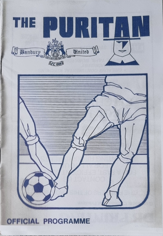
I introduced the wording, “THE PURITAN” and picked a typeface that was bold and suited the format of the programme cover. Whilst setting it up I realised that the “A” of Puritan bore more than a passing resemblance to the style of hat associated with the Puritans in the 17th century. A few strokes of the pen added a brim to the hat, a geometric face and shoulders and a collar and the Puritan Man was born, albeit with a certain amount of chance. Added to that, the space in the A closely resembled Banbury Cross.
Fellow loyal Puritans supporter, Keith Whittingham, who worked in printing at the time, took the design and produced the covers, and we also devised posters advertising upcoming games which also included the Puritan Man.
A short while afterwards the team shirts started to sport the Puritan Man, together with the wording Banbury United FC, and that has continued from then until today 34 years later. Although the design was modified slightly by the club when computer-aided design arrived, changing into the logo in the circle we have currently, the original design has survived onto the popular blue and white away shirts this season, and has also been seen as a white logo on black sweatshirts and tee-shirts in the club shop. Both still look effective.
![]()
The original logo design cost the club nothing, and after 34 years it owes the club nothing, but has been a solid representation of the Puritans and as readily identifiable as Banbury United, as the cockerel logo is to Tottenham Hotspur, the cannon to Arsenal or the Red Devil to Manchester United.
Times change and the club, with its ambitions, must be able to move forward.”
Malcolm Wood (Puritan supporter since 1963).